What’s hot in UX this week

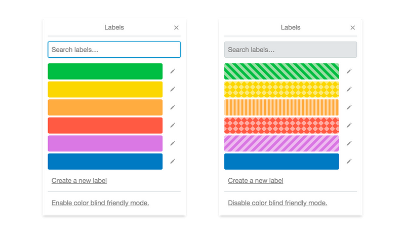
Designing For (and With) Color Blindness →
As designers, we constantly worry about legibility, how engaging content is, whether hit targets are big enough, or if a user can navigate through a workflow. But we often forget about the one in ten people that are colorblind.
“Too many times have I downloaded an app or game only to realize that using it was a huge pain. I’m often unable to distinguish one object from another or determine how something is labeled. If 1 out of every 10 users finds your app to be difficult or even impossible to use, your ratings and reviews will drop drastically.”
So, how do we test for this? How do we fix any issues? And how can we prevent issues from popping up to begin with?
via @giuvicente
Great Designers are Great Communicators →
It’s not easy to talk about design. Every designer has had to justify their decisions to a stakeholder, yet most lack the ability to convince people they’re right.
via @caioab
GoPro’s Guide To Great UX →
For the GoPro UX design team, understanding how software and hardware intersect is the key to a product’s success. Clair Byrd’s interviews with design teams are part of the “Inside Design” series for Invision. Read them first at Co.
via @fabriciot
Designing Data-Driven Interfaces →
“Dashboard”, “Big Data”, “Data visualization”, “Analytics” — there’s been an explosion of people and companies looking to do interesting things with their data.
via @fabriciot
The Hidden Power of Inconsistency in Design →
Consistency in design is advisable most, but not all, of the time. Absolute consistency is repetitive to the point of boredom. In order to mine its benefits without putting your users to sleep, you need to know when to break the monotony.
via @caioab
Signing in to Medium by Email →
Until now, you could only sign in to Medium using Twitter or Facebook. Both these services make signing in quick and easy, and also allow us to build out our users’ connections, so we can show them stories written and recommended by people in their network.
via @caioab
Why Empty States Deserve More Design Time →
An empty state, or zero-data state, is an afterthought for many designers. The thing you design last — if at all — because it’s a temporary or minor part of the user experience. But don’t be fooled by the name.
via @fabriciot
Twitter’s Biggest UX Problem: Who The Hell Is It Designed For? →
Project Lightning tries to split the difference between change-resistant power users and the new users Twitter desperately needs. Yesterday, Buzzfeed broke news of Twitter’s so-called Project Lightning, a long-running attempt to recast the service with a simpler, more engaging UX.
via @gaitha
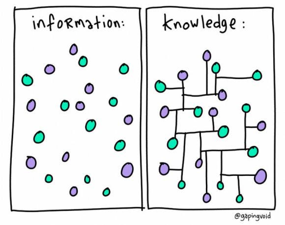
Image of the week

via @gaitha
From your friends at uxdesign.cc
Share the love ♥

