


Design jargons: an interview with Sagi Shrieber, from Hacking UI
Why do we get so attached to buzzwords and jargons in design? Are they really the shortest path to explain something, or are we just…

Why do we get so attached to buzzwords and jargons in design? Are they really the shortest path to explain something, or are we just following the hype?

Following up our report on the State of UX in 2017, we are interviewing designers who are big thought leaders on important themes for the design community in 2017. Let’s keep the conversation going!
As a co-founder of Hacking UI, Sagi Shrieber follows the design industry closely. We talked with him about the rise and fall of buzzwords and what trends are bringing new jargons to the field.


The words we will stop using
Words are funny. They carry a lot of meaning, and it’s interesting to look at how that meaning evolves over time. Do you still need to sell your design as “mobile-friendly”? Do you still describe experiences as being “intuitive”? What does that even mean?
Back in 2011 everyone was talking about Responsive Design. The possibility of designing and building one single web experience that was able to fluidly adapt to multiple screen sizes was eye-opening at the time. Interestingly enough, fluid layouts are a native functionality of HTML — but over the years web experiences had been built with too much focus on large, desktop screen resolutions.
We went back to the basics and proudly coined it “Responsive Design”. It was the topic everyone was writing, reading, and tweeting about that year.

Interest in the search term “Responsive Design” over time (source: Google Trends)
Fast forward a couple years and designing websites that are responsive is the new norm. Now we only call out the exceptions, and in many teams, projects and companies, responsiveness is an assumption that everyone makes right from the get-go.
The evolving meaning of words
“Responsive Design” is just an example of adjectives that become unnecessary over time:
We don’t sell an experience as being “intuitive” — we prove it through user testing and positive feedback from customers.
We spend less and less time arguing whether a piece of content should live “above the fold” or “below the fold”; the plethora of screen sizes we see today are quickly making concepts like “the fold” outdated.
We don’t say something is “just two clicks away”; the burden of extra clicking was a bigger problem when interactions were limited to cursor and hyperlinks on a low speed connection.
We don’t sell our process as being “human-centered”; it’s an assumption that any capable and successful company these days will bring users to the design process at some level and at some point in the project.
Want another example?
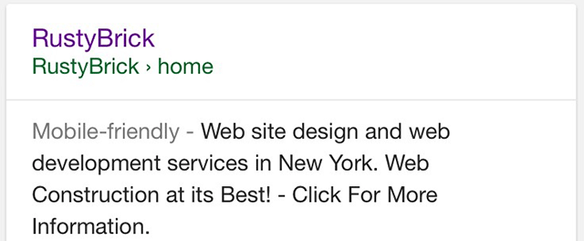
Google’s search results page on mobile
2016 was the year Google decided to remove the label “mobile friendly” from its search results. According to Google’s search team, “85% of all pages in the mobile search results now meet the appropriate criteria and show the mobile-friendly label”. Since the vast majority of mobile results are mobile friendly, there is no need to label them as such.
All websites are now (or should be) “mobile-friendly”, and as a designer you don’t need to keep stressing that over and over when you present your mockups to someone new.
Quickly, our vocabulary shifts and evolves to let us focus on new design challenges.
What words are you crossing out of your daily lexicon in 2017?
What new words will you be adding?


Sagi Shrieber is a designer, writer, & entrepreneur. Co-founder of Hacking UI, founder of @pixelperfectmag, and a UX mentor for startups at Google Campus.
What are the new words you see yourself using more often recently? Any new terms that were not part of your vocabulary two years ago? Any words you have stopped using?
Sagi: I don’t recall any that I stopped using. Somehow all the old buzzwords still exist around me. But here are some I started using in the past year:
Micro-interactions
Back then it was all about creating prototypes. Animations were sometimes done in After Effects. Recently (in the past year or two) a lot of new tools came out which a were only about that.
Tools like Principle and Origami are now used to communicate transitions & animations better than ever.
In the past couple of years, proper page & states transitions have become the norm. People now expect to see them in apps. If they don’t see them in an app they use, the app will feel weird to them, and this may cheapen the brand at hand. Therefore, we designers need to properly craft them and make sure they also look good in the final product. Regular prototyping is not enough. We need to also present the Micro-Interactions and animations in the UIs that we design. The tools to create these and communicate them outwards were still lacking about 2 years ago. But as the need for those tools arose, so did the tools themselves.
CX — Customer Experience
For me, up until last year or so, it was all about UX — User Experience. Up until recently I was working as Design Director at a Saas Company called SimilarWeb. There, at one point, we started to talk about CX — Customer Experience, as a separate term than UX.
This minor term made a great impact on the way we worked on our product.
In any paid app, customers have different expectations than non-paying users or anonymous visitors. Therefore, paying customers can have different experiences crafted for them.
Paying users are not regular users, and should not be experiencing the product as such.
CI — Conversational Interfaces
This is a term that all of us hear way too often.
I think Messenger and Slack got it pretty much figured out. They are CI platforms, so bots feel natural when integrated there. But, on the other hand, conversational interfaces I’ve seen on other platforms look pretty bad.
I think we designers have a lot of fun work ahead of us with CI that will occupy a lot of us in 2017. We actually brought in an expert bot designer to give a talk about this topic in our Master Class.
We need to figure out how to make CIs look good, and feel good, on a website when replacing a form.
We need to make CIs not scare us. We need to make sure they blend into any possible environment.
If we succeed in doing so, it will better the entire user experience of online forms, as well as many other UI elements.
Micro-copy
Another one for the “micro” terms family.
Micro-copy is a term that I guess has always been there, but I started hearing it just in the past year. It’s basically another name for copy on specific elements in UIs.
I think this term does us — user experience designers — a great service. Here in Israel, a great book about that topic was written and self published by Kinneret Yifrah (Book is available in English now btw). The book became popular here in Israel. Soon after, I even started hearing hearing non-creative executives mentioning this term.
Emotional Design
This is a term that I always preached about and believed in, and I bet many other designers as well. But only in 2016 had Medium started blowing up with posts about the topic.
Like previous terms, it’s a matter of the norm and market expectations.
People have already got used to beautifully designed apps. They are now looking for more. It’s just a natural evolution that puts more responsibility in our hands as designers (which is a good thing).
As designers responsible for projecting experiences that are relevant and interesting for our users, what words do you think we’ll be using more frequently in the next two years?
Sagi:
Generated layouts
I think that the term ‘generated layout’ (or something similar) will arise.
Soon, AI based design apps will hit the market.
With just a few inputs on our side — those apps will be able to build out hundreds of beautifully designed layouts for us to choose from. Leaving us the job of tweaking and customizing those generated layouts.
CI Jargons
Have you heard of the floating labels pattern in UI design? Well I bet we’ll have something similar in CI (conversational interface) design.
Probably something like ‘boxed bubbles’, or ‘fluid response boxes’ or something along those lines.
Lol, I can’t wait to see what terms arise from the upcoming design trends in CI.
Are these buzzwords good or bad? How do these trending topics or jargons affect your work and your side projects?
Sagi: I believe that they mostly do not affect my work, although there are some exceptions. Some terms do make us think differently about a certain aspect of our work. For instance, the term CX (customer experience) that I mentioned above, made us think about the experiences we craft for our paying users in a slightly different way.
In general, I believe in proper communications.
If we just throw buzzwords around to clients and stakeholders, we might sound ‘smart’ but we will miss our goal of communicating our ideas well. We must learn to adapt our choice of words to whoever we’re communicating with. If there is a term we MUST use in a certain discussion, then we should explain that term first and why we’re using it, rather than just throwing it around.
To finish, I invite you to try and do the following:
Pay attention in the following week to the conversations you have with colleagues, stakeholders and clients. Try to notice — when are you using UX jargons or buzzwords, and think: “what could I have used instead of that word”?

Thank you Sagi Shrieber for your participation, and be sure to check out his latest project — The Master Class: a series of free online talks about emerging technologies for designers. See you in the next interview.